UW Interactive Data Lab
papers
Techniques for Flexible Responsive Visualization Design
Jane Hoffswell, Wilmot Li, Zhicheng (Leo) Liu.
Proc. ACM Human Factors in Computing Systems (CHI), 2020
Proc. ACM Human Factors in Computing Systems (CHI), 2020
Materials
Abstract
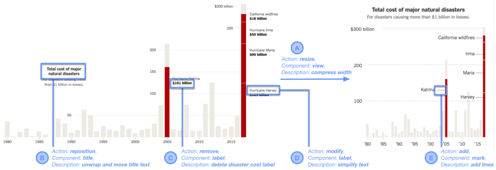
Responsive visualizations adapt to effectively present information based on the device context. Such adaptations are essential for news content that is increasingly consumed on mobile devices. However, existing tools provide little support for responsive visualization design. We analyze a corpus of 231 responsive news visualizations and discuss formative interviews with five journalists about responsive visualization design. These interviews motivate four central design guidelines: enable simultaneous cross-device edits, facilitate device-specific customization, show cross-device previews, and support propagation of edits. Based on these guidelines, we present a prototype system that allows users to preview and edit multiple visualization versions simultaneously. We demonstrate the utility of the system features by recreating four real-world responsive visualizations from our corpus.
BibTeX
@inproceedings{2020-responsive-vis,
  title = {Techniques for Flexible Responsive Visualization Design},
  author = {Hoffswell, Jane AND Li, Wilmot AND Liu, Zhicheng},
  booktitle = {Proc. ACM Human Factors in Computing Systems (CHI)},
  year = {2020},
  url = {https://idl.uw.edu/papers/responsive-vis},
  doi = {10.1145/3313831.3376777}
}