The Many Languages, Many Colors Project
Does everyone think about color the same way? Are there color names that can't be translated between languages?
Purpose
Different languages divide the color spectrum in different ways, which has been shown to influence how people perceive color. The Many Languages, Many Colors project is an attempt to measure these differences by collecting data and creating color models, and then share the results through visualizations and publicly released data sets. But first...
Take the Survey!
Before you look at what we found, please consider taking our 15 minute color perception survey. We could always use more data, and exploring these datasets first might influence your answers.
Visualizations
We have created a number of different visualizations to share our results:
Color Name Summaries
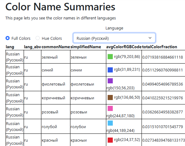
See summary data about color names in different languages.
Color Translator
![]()
Find translations and synonyms for colors in multiple languages. Compare the ranges of colors for different color names.
Hue Color Comparisons
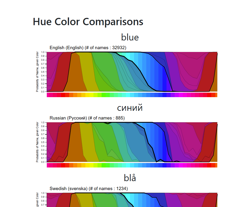
Compare the terms used to divide the hue colors (the brightest, most saturated colors:  ).
).
Full Color Comparisons
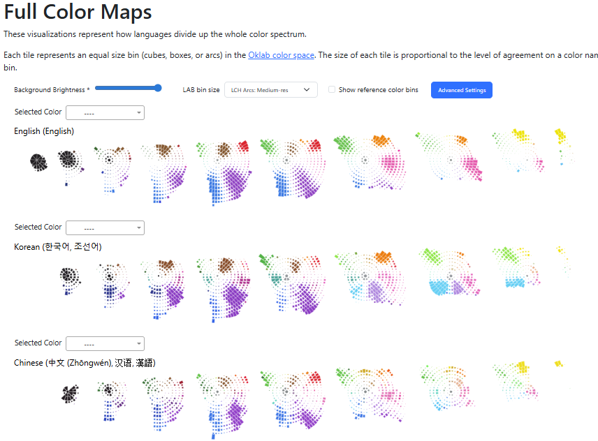
Compare how languages divide the full color space.
Korean-English Translation Comparison
![]()
Compare online color translations to our suggested translations.
Korean-English Viridis Color Spectrum
Compare how Korean and English color names differ on the Viridis color spectrum (  ) that is sometimes used in visualizations.
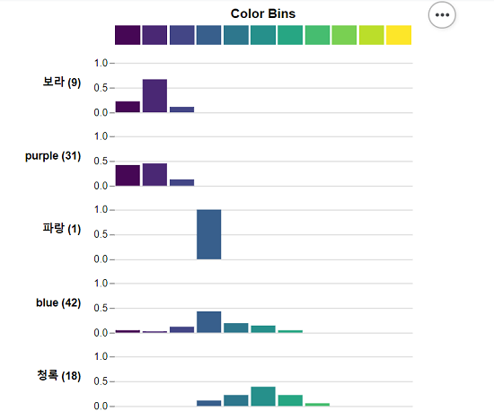
Full Color Bin Options
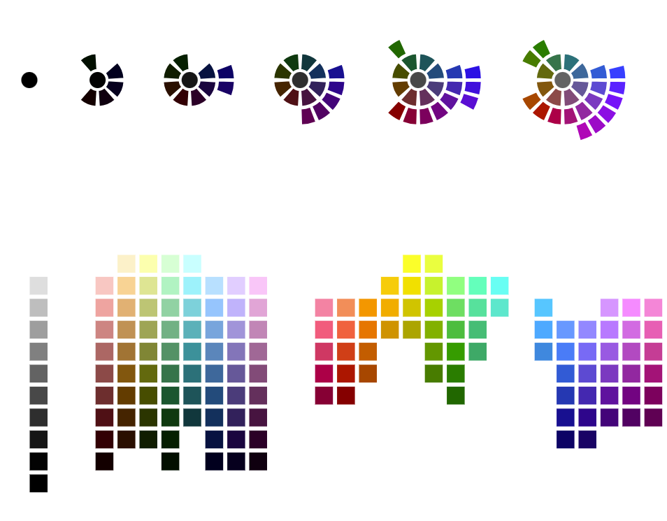
Explore different options for binning and visualizing the full color spectrum.
Color Name Data Entries
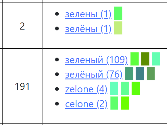
Explore the data name entries we collected and see how we group them together in our data cleaning process.
Other views
- Oklab and Oklch diagram: a diagram to show how Oklab and Oklch are related
- Color Composition Figure: a compact version of the Hue Color Comparison
- Language Term Clustering: Prototype view of to clustering color names based on if participants used them together
Summary Blog Posts
Read our blog posts that summarize our results:
There is No "Blue" in Korean: Different Languages Have Different Colors
Dataset
We have made our dataset, models, and visualizations freely available for download (both the 2019 EuroVis publication version and later updates). We plan on continuing to update this dataset as we collect more data.
Publication
Peer Reviewed Academic Paper: Color Names Across Languages: Salient Colors and Term Translation in Multilingual Color Naming Models
Note: We made a minor calculation error on one graph in the paper, you can see the corrected version of the graph here.
Contributors
Kyle Thayer, Younghoon Kim, Gabriella Silva Gorsky, Jeffrey Heer, Anthony Wen (Chinese Translation of study)
Data Status:
Last Raw Data Upload: May 21st, 2026
Last Data Processing Update: May 21st, 2026
Note: This site has up-to-date visualizations, you can see the old 2019 EuroVis publication visualizations are here.